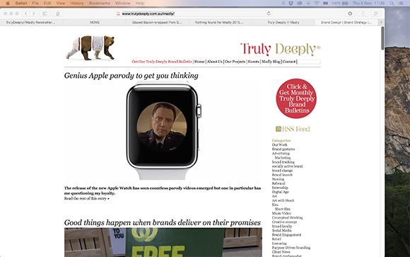
Did Coca-Cola invent the red Santa suit to match the brand...
...Clever bit of branding but...
One of the best branding myths is the popular belief that Coca-Cola invented the red Santa suit to match their brand… Wrong!Â
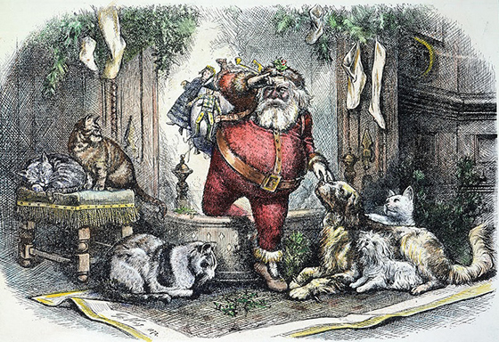
Engraving by Thomas Nast Harper’s Weekly 1863-1886
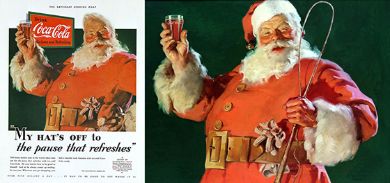
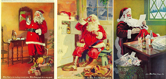
Coca-Cola was not the first to depict the image of Santa Claus in a red suit. Thomas Nast drew Santa Claus in a red suit for Harper’s Weekly between 1863 and 1886. White Rock beverage adverts showed the classic red Santa suit in ads selling mineral water in 1915. Coca-Cola ads that featured red-suited Santa Claus, comes from around 1931.
White Rock beverage adverts 1915.
The origins of the modern-day Santa Claus can be traced back to Saint Nicholas or Sinter Klaas, famous for his kindness to children and generosity to the poor. St. Nicholas was pictured dressed in red and white bishop's vestments, but over time the bishop’s attire was replaced the familiar fur-trimmed suit. There are records of Santa wearing various coloured costumes, but red was by far the most popular and became known as the quintessential Father Christmas outfit.
Coca-Cola's involvement begins from the early 1930s when artist Haddon Sundblom illustrated ads for Coke featuring Santa in a red coat trimmed with fur and a large belt. His drawings were used in the company's festive advertisements for the next 30 years, creating the urban myth that Coca-Cola invented the red suit to reinforce the brand, and they haven’t done much to dispel that myth!
I like the story of the artist Haddon Sundblom, who modified the original painting (to save on the costs of canvas and paints!) to create the 3rd commission, see the video from Coca-Cola. I bet that got him a little more profit out of Coca-Cola!Â
With all these Christmas Greetings popping up in your inbox, do you ever consider their origins? Greetings cards as we now know them, started in the fourteenth century with beautiful woodblock printed New Year's cards from Germany.
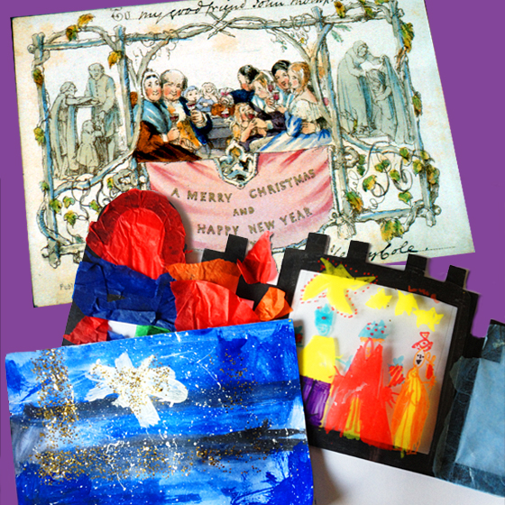
Apart from the German origins, the modern Christmas card is quintessentially an English invention as the first real Christmas greeting cards were "Christmas Pieces" made by children in the early 18th century. (And a tradition still going today - as you can see from the two (of many!) from my two (now not so young!) boys!)
However, the origin of the first Christmas card as we know it today can be traced to a card printed in December 1843 at the request of Sir Henry Cole, the first director of The Victoria and Albert Museum. Sir Henry would hand write greetings to family and friends on paper decorated with Christmas themes, but Sir Henry felt this was most inefficient so he commissioned a Christmas card with a single message that could be sent to everyone.
The Words "A Merry Christmas and a Happy New Year to You" were written on this card and so becoming the "standard' Christmas card message.
Tracy Reck has been running her business for over 4 years, offering Personal Training, Nutrition Coaching and workshops specialising in coaching individuals so that they feel amazing about themselves. 


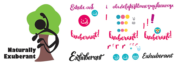
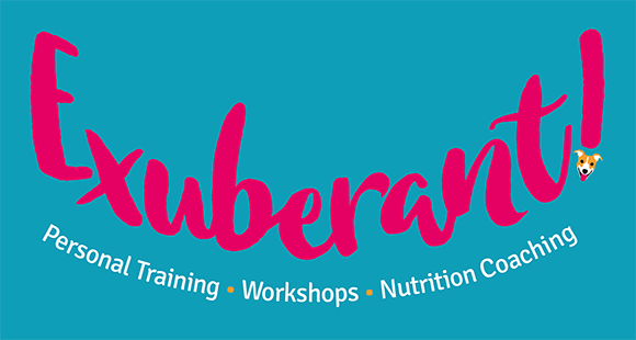
Over time her company has evolved and moved direction from where she started as a straight forward outdoor personal trainer. Tracy made a decision to move the branding and rename it ‘Exuberant!’, so it is in line with this new direction and to help move further into new markets.Â

I met with Tracy, firstly to discuss and understand her and the business values. I listened carefully, this information helped me to create specific design ideas and concepts that were appropriate for Tracy and Exuberant!Â
The design brief was to move the branding away from the original ideas of natural colours and outdoor Personal Training to a more lively, active and caring image. We worked closely together on the final refinements of the concepts making subtle tweaks and adding intensely personal elements that finished off the Exuberant brand. 


Tracy really enjoyed the whole design process and journey with Steve, prompting her to say “The brand that Steve designed is a perfect fit for my business. It manages to encapsulate what it is that makes me proud of and love what I do, and I'm excited to share it with the world.â€Â


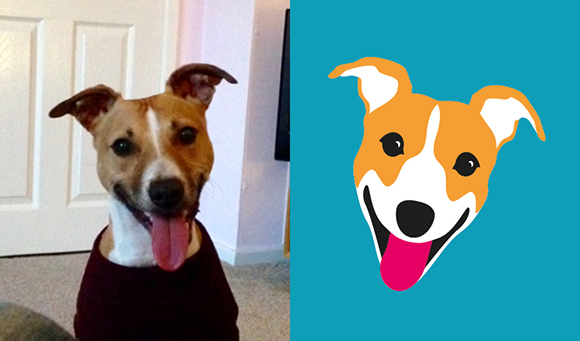
You may have noticed a dog featuring in the design, it is not just a random dog illustration. This is “Buzzâ€. He is one of Tracy’s and her partners two rescue dogs. He appears in quite a few of Tracys social media posts like this one on twitter. He quite a part of the team. He has a unique zest for life, so fits in well with the “Exuberant!†brand! Watch Tracy and her “furry training partner!â€
Does your company branding need a refresh? Are you just starting out and need that confident look? It would great to have the opportunity to find out more about your business and to explore the possibilities of how I can help you, as I have helped Tracy and the Exuberant! brand. To find out more, please contact me...
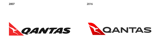
“A fresh brand helps symbolise the new era Qantas is entering as we head towards our centenary. It’s an era of new destinations, new technology and a new standard of service,†said Qantas CEO Alan Joyce.
“This is not just a change of logo; it is far greater than that. There is a significant transformation programme across Qantas and on-going investment and commitment to continuing to improve the overall brand and customer experience,†said Olivia Wirth, Qantas Group executive brand, marketing and corporate affairs.
It will be down to the customers of Quantas and their “customer experience†of the brand to see whether it hits the mark... What do you think?
From a visual branding opinion, has it hit the mark?
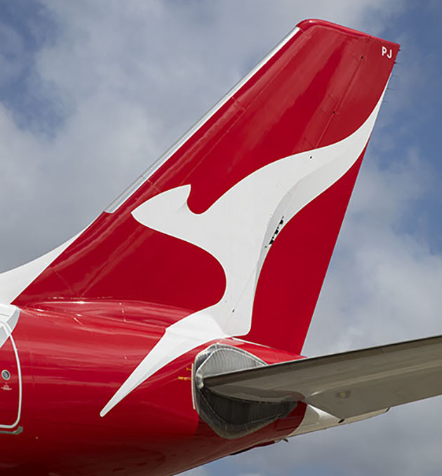
The new roo!. Very subtle shading on roo’s body and tail (Almost unoticable!). (Pic Seth Jaworski)
The design agency said “This new brand is more streamlined and the shading behind the kangaroo gives a better sense of movement and depth. A silver band now extends from the tail to the rear of the fuselage, to give a more premium feel,â€
“The typography for the word Qantas, which measures almost two metres high on the 787, has been carefully streamlined. And Qantas will appear on the aircraft’s belly, so you can tell when it’s the national carrier flying overhead.â€
Quite how you “streamline†the typography, I thought it at least would need some movement and it pretty lacking in that! Has it been taken that streamlining means to remove personality from our brand? Let me know what you think...
NEW QANTAS BRAND SUMMARY
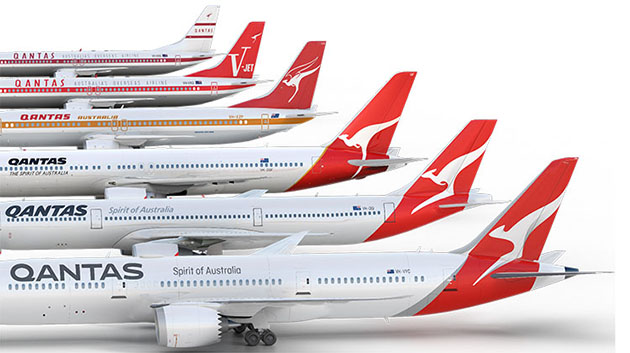
A streamlined kangaroo on the tail of the aircraft, with shading to give it a sense of depth and movement. The kangaroo itself has been simplified for a cleaner, more modern look.
A silver band has been added to the rear of the aircraft, flowing from the tail through to the rear of the fuselage for a more premium feel and more contrast between the red tail and the rest of the aircraft.
A new, slimmer font for the world ‘Qantas’ on the side of the aircraft and the colour made slightly lighter.
The word Qantas is added to the belly for increased visibility when aircraft are flying overhead.
Adding the kangaroo to the inside curved edge of the wingtips so that they are visible in-flight and meaning they will also appear in pictures people take out the aircraft windows.
Replacing, centring and enlarging the kangaroo that appears on outboard engine cowls, so that it is more prominent and identifiable.
Re-introducing the iconic ‘winged kangaroo’ that featured on Qantas tails in the 1960s, ’70s, and ’80s by placing it under the cockpit window and integrating it with the aircraft name currently in this position (note: the actual aircraft names are unchanged). The classic ‘Qantas red’ and white of the fuselage are unchanged.
“Don’t try to manufacture a place in the world. Don’t obsess about the competition and differentiating from them. Instead, as with all good design, start with the question ‘why?’. Why do we exist? Why would anybody need us? Why is what we do useful? Why would people pay (in time or money or whatever) for it? Why is it valuable (in all the senses of that word)? In other words, define a sense of purpose – the difference you want to make, socially and commercially.â€
These words are from and article by Wolff Olins CEO Karl Heiselman and Head of New Thinking Robert Jones.
My purpose?
I want to make a real difference to customers branding...Â
Why?
I hate to see bad font choices... Inconsistent or inappropriate colours... Lack of thought and therefore credibility... (that’s just 3 for a start!)
The purpose does not need to be grandisose, it can be as simple as why am I doing this leaflet!
 If you would like talk more about my purpose, call me...
My son has recently started high school and so a new level of homework starts. We have to "help" with subjects I had long since forgotten about…!
We got on to safer ground with Art Homework! Leonardo Da Vinci was the first artist to study. To be able to investigate, share and revisit one of the finest renaissance artists with my son was wonderful. My memories of Art History lessons were rekindled. At the time, you don't "get it", but as you learn, you understand that you need to know what has gone before...
However, the next artist, Albrecht Durer, prompted the question,"who?" So we researched together and I enjoyed discovering some stunningly accurate watercolours and I particularly admired his woodcuts and engravings. So it goes to show, after (what felt like!) years of Art History, you never stop learning! Future topics for Art homework include Impressionism, Cubism, Pop Art... So we will see what new things we learn and maybe inspire us... Maybe my favourite - Caravaggio might crop up, although he is a little brutal for young eyes, but oh the light effects!
Which led me to think about the word "inspiration". What is inspiration? As a designer, I am constantly looking at visual ideas. I simply can't switch off, I can't stop looking at things through a designer’s eyes! Inspiration comes from the most unexpected places doodles and sketches, book covers, magazines, typography, packaging, obscure graphics, mood boards, Google images is a treasure trove of visual "stuff" but often the subtle, small things "inspire" and it's recognising them when you see them!
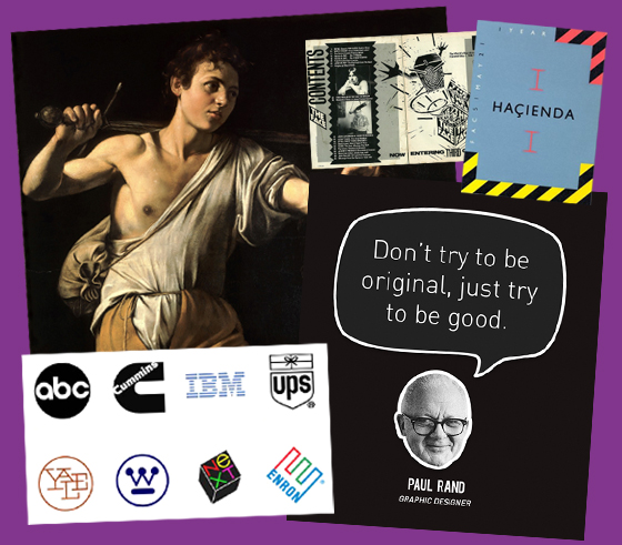
Some of the designers and typographers I particularly enjoy are: Paul Rand, Saul Bass, Neville Brody and some of the work by Peter Saville (such as the sandpaper album cover and iconic designs for The Haçienda and Factory records). Tell me who is your favourite artist or designer, so we can share and can keep learning...
I have collaborated with Marketing2Win since 2011, working on a variety of branding projects. However, one project presented a new challenge.
Maximus Handling Systems Ltd. wanted to present a static workbench in a dynamic and innovative way. We conceived a simple concept of an animation featuring explanatory words and photos of the product.
The range of GBP Ergonomic Workbenches starts with a simple format, which, with the addition of relevant accessories, can be developed into complex workstations. We wanted to show the progression of this simple modular system with a short 90-second video.Â
Photographs were commissioned to show the workbench in its various stages of development and a storyboard was created to plan out the flow of the video. By carefully incorporating photos and hand-drawn graphics, we were able to enhance the industrial use of the product.
The final version of the video successfully showed a simple product with its many variations. Because of the extensive range of accessories, a further two short videos were required to show how adaptable the GBP Ergonomic Workbenches really can be. These short videos now feature on the client’s website, feature in their email marketing and are used by the company’s distribution network.
James Williams, proprietor of Marketing2win commented,“Steve had a clear idea of how to best present the workbenches to maximise the viewer's interest and to highlight the features and benefits of the workbenches.â€
A great project, a new challenge... a simple solution.
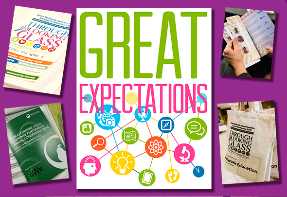
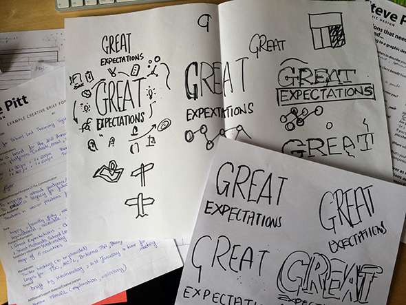
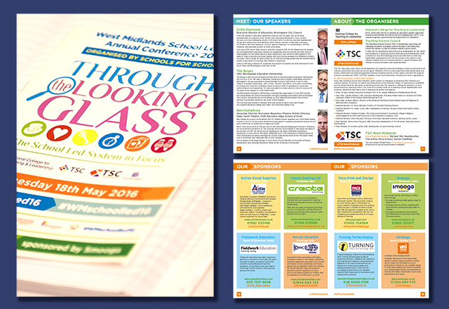
I met with Rose Padmore of Opening Doors and Venues at a local Bromsgrove networking event. Rose was working on a project on which I was invited to work as part of their team. I met Rose and her colleague, Madalina, at their office and they explained their thinking for the West Midlands School Leaders Annual Conference theme, which was ‘Great Expectations’. During this meeting, I scribbled down notes and made sketches to record our thoughts and ideas.
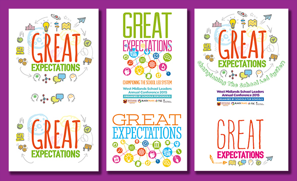
Rose and Madalina are very competent Events and Conference organisers. They collaborate with other skilled professionals to help them achieve great results. My contribution was to design two concepts for Opening Doors and Venues, which they presented to their client. The preferred design was chosen (see top) and we applied this branding to booklets, website graphics, signage and all visuals material, so presenting a consistent image.
The preferred concept featured unique icons, strong colours and a fresh look designed to engage people with the conference brand. The booklets, signage and internet banners displayed the identifiable brand elements. In addition to the creative design component, I managed the project, providing print-ready finished artwork for the booklet and large format prints.
Rose Padmore spoke about our collaboration“We often need to create a brand identity for client events to be used on all communication platforms including the event website, twitter, facebook, e-shots and event signage. So on this occasion, with an extremely short deadline, we called Steve and he actually came to see us that very afternoon. Well, we hit it off straight away (I think we talked the same language) and Steve left with the outcomes of a very animated brainstorming session aided by coffee and biscuits! A few days later we had 2 concepts to show our client and, following a few tweaks, a finalised brand was signed off in just over a week. Thank you, Steve, you are now, most certainly, a highly regarded supplier of OD&V.â€
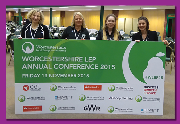
Subsequently, Steve Pitt - Brand Identity Creation assisted Opening Doors and Venues with branding for other conferences. With the Worcestershire LEP Annual Conference, we had to work within strict branding guidelines set out by the Worcestershire LEP but we were still able to produce a vibrant booklet to accompany the conference.
In 2016, the theme for the West Midlands School Leaders Annual Conference was ‘Through the Looking Glass’.
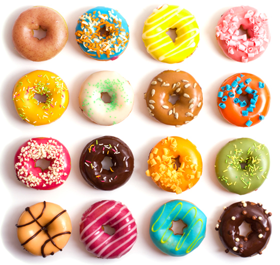
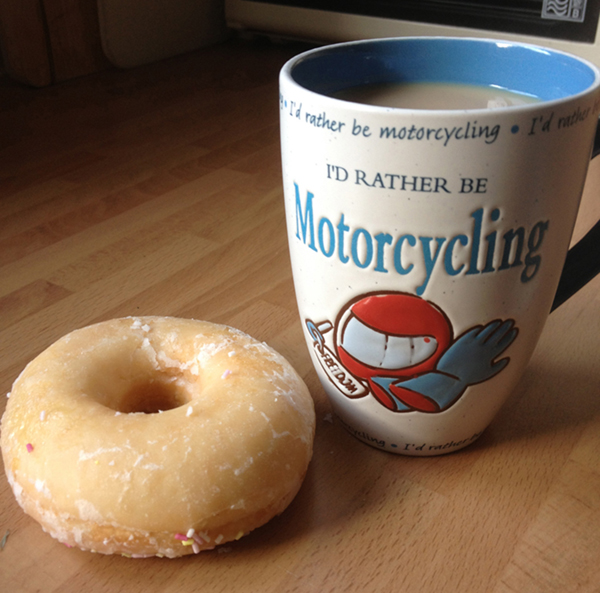
I have a weakness for doughnuts. Freshly baked, covered in icing and served up with a steaming cup of coffee. Some say (my wife) my liking for these sweet treats goes a little too far...Thinking about it, there is big similarity between the icing on a doughnut and a company's Visual Branding...
If you ever have a hankering for a doughnut, pop into any bakery or supermarket. Very rarely will you find a "plain old doughnut". Choose one, or more, with a simple sugar coating, an iced glaze topping or an elaborately decorated creation with chocolate curls - MMMmmm... Each one is trying to catch your eye, "pick me - have a bit of what you fancy!â€
You could choose a simple doughnut, trustworthy, you know what you are going to get. On the other hand, you could try one with a few sprinkles that can surprise and delight you... Alternatively, you could go the whole hog and get an elaborate one, although these can be a bit rich.
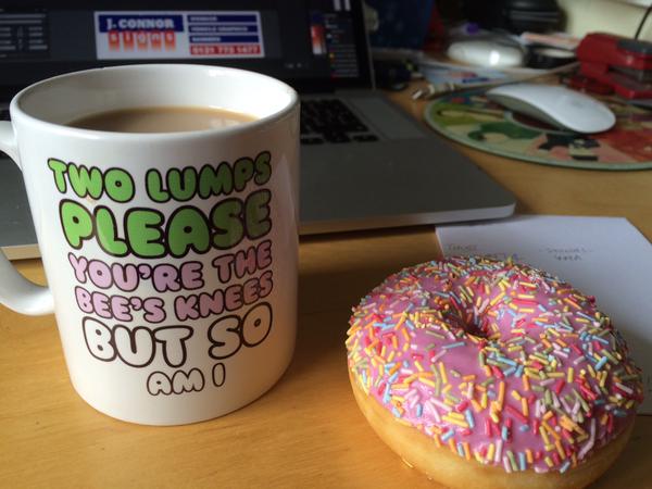
The doughnut you pick will depend on how it looks and then how you think it is going to taste... The same is true of your Visual Identity. Your choice is based on how it looks and but then how it makes you feel. Do your corporate colours project confidence or are they insipid? Is that font too strong, too weak or simply plain and unmemorable? Does the overall design make you feel inspired or does it leave you cold?
So is your Visual Branding a plain old doughnut, an iced one with a few sprinkles or is it a luxuriously decorated one? And remember that a well-designed Visual Branding is more than just sugar coating...
I have had a lot of fun with some recent Branding Identity Creations, working with clients to get the result that they want and I would welcome the opportunity to tell you about the work I do. Let us meet and talk about your Branding Identity... Perhaps we can get together for a coffee - I will bring the doughnuts!
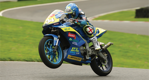
I am a very keen motorcyclist and motorcycle-racing fan and I have found a great way to combine my interest in all things bike related with my graphic design skills.
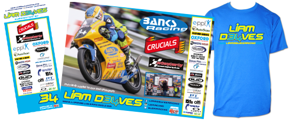
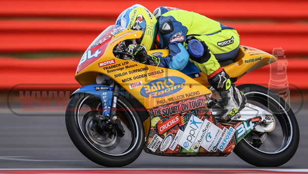
Liam Delves is a young, aspiring motorcycle racer. After a few very successful years in club racing, Liam was making the big step up to a National UK racing series, the Motostar championship which is a support series to the British Super Bikes. J Connor Signs was helping Liam with some colour prints and signage such as pop-up promotional banners and I started getting involved by doing some artwork for him.
Liam in 2014 -
FORMULA 125 CHAMPION
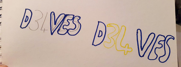
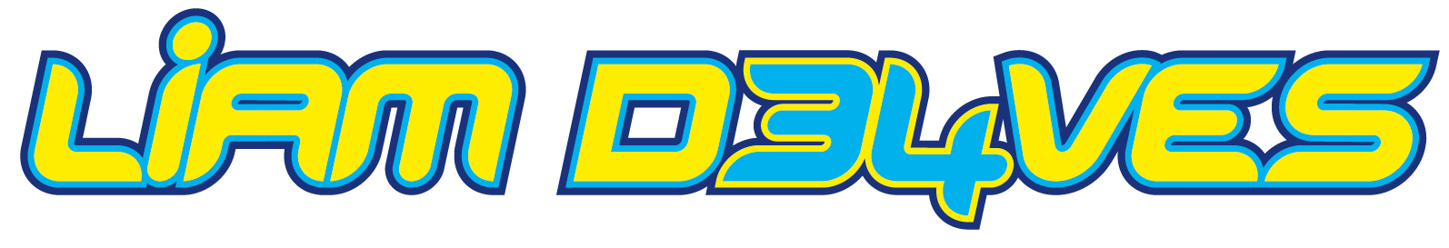
Liam did not have a consistent brand. I chatted to him about it and we looked at other motorcycle riders, particularly MotoGP riders and the graphics that inspired him. I asked Liam to sketch what he had in mind for his ‘logo’. Liam’s rough draft was the catalyst for his new, dynamic brand. I just needed to find the right font to suit a young motorcycle racer. I didn't have to look far. I had a clear idea of the style of the one I wanted.
Liam’s colour scheme was set as blue and yellow. The first concept was spot-on. Liam loved it straight away — sometimes you can do that with a design, you just get it right first time!
So Liam's eye-catching brand moved from a very young cartoon style to a mature, strong and confident name style! His race number for his bike is included in the graphic, which now appears on T-shirts, posters and pop-up banners.
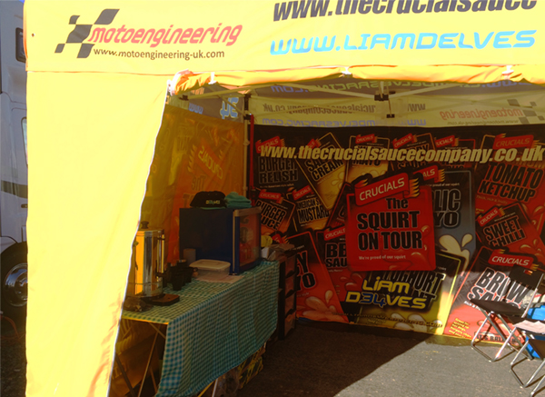
At the start of the 2016 season, we upped our game. The bottom of the bike’s fairing was covered with a ‘wrap’ promoting Liam’s strong association with all of his sponsors. We updated all of his promotional material and even have a sponsored/branded gazebo.
This season, Liam has finished 7th and 8th in his first two races. I am lucky enough to be invited to the pits on race days and be part of a race team!
You too could be part of Liam’s success. Sponsorship opportunities are available, so if you fancy getting involved, please get in touch with me. It’s a great feeling seeing your name on the side of a race bike!
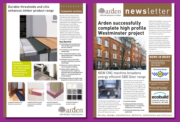
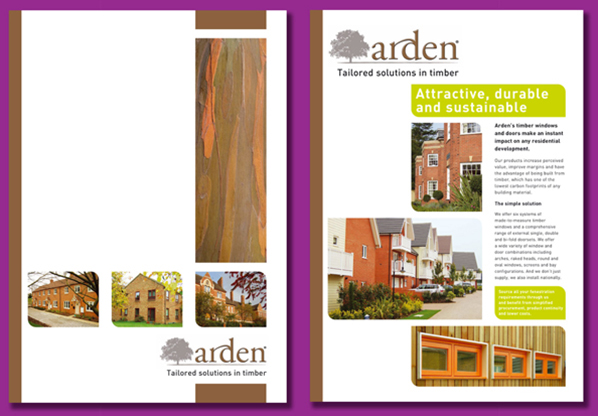
Arden Windows Ltd is a high-end window manufacturer based in Coventry. When I started working with them, their trademark was simply a logo. My remit was to develop a wider visual identity for their brand including an appropriate font and layouts to promote an authentic message that represented Arden’s ethos and brand position.
Understanding the company’s products, culture and expectations was fundamental to the development of a powerful visual identity. Clarity, creativity and consistency would ensure Arden’s brand would stand out against their competitors. The typeface reinforces the precision engineering used in the manufacturing processes. All designs had to be in line with their pre-existing marketing materials.
After a comprehensive briefing with my client combined with my detailed knowledge of the principles and rules of graphic design, the creative process can proceed quickly. After the initial proof, the layout rarely needs major changes. A few minor refinements will conclude the final product.
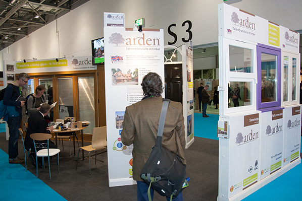
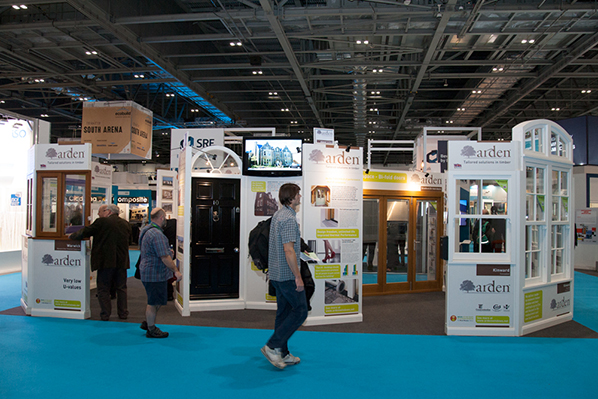
The principle material from which Arden’s windows are manufactured is sustainable wood so the logo and colour palette reflect the environmental and organic credentials of the product. In 2015, Arden Windows exhibited at the Ecobuild exhibition at Excel in London. The visual identity was developed to work on large-scale exhibition panels. The finished designs were then printed directly onto Foamex. A decision was taken early in the design process to include several panels that were text biased, these panels proved very successful. When the stand was busy, visitors could read useful information about the product.
To avoid handing out the more expensive larger format brochures, we created additional support material for the exhibition, specifically small leaflets to distribute at the show.
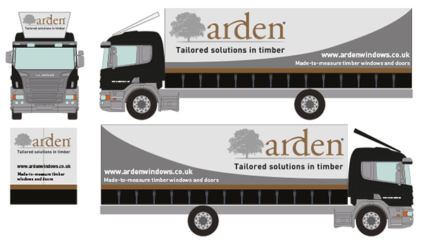
The production deadline for the project was three days before the London show when a vehicle was leaving the client’s premises. So working back, gauging lead-times for all elements of the assignment, ensuring all dates for each separate part, all came together to be loaded onto that truck! (I designed the livery for the truck too!)
The exhibition was a great success, with many contacts signed, orders taken and enquiries generated for new business. After the Ecobuild exhibition, we publicised the client’s accomplishments on their website and in their newsletters.
Ecobuild 2015 was so successful that a stand was booked at the 2016 exhibition and we are just completing that work now!
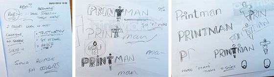
A phone call from Rob and a meeting at my local pub was the start of a neat logo. I remember the day, it snowed and I was concerned about his return journey, I know what the weather can be like up in Romsley!
Rob had T-shirt printing business and he wanted to present a professional image, so he invited me to work with him. We talked about Rob as an individual, his personal values and why his business was important to him. He said it was getting the job done and getting it done well that mattered. The company name was going to be Print Man and it was about the man not just printing T-shirts.
Initially, we discussed words to describe his business, solid, trustworthy, confident, credible, reliable and pride. Rob is a personable chap and I was keen to reflect his personality. I also asked him to do some homework - to look out for any design ideas that he liked. At that first meeting, I made some initial sketches, to see if the business name worked better in capitals or lower case then adding some shapes that I had in mind... I imagined the ‘T’ in the word print becoming the shape of a person...adding a circle for the head it became a figure with the arms stretched in a welcoming pose...I also sketched the ‘T’ curved – like peeling off a transfer.
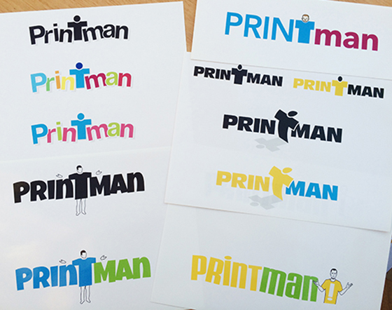
It can be great fun to choose what I see as the most appropriate choice of fonts. Thinking about the adjectives, solid, trustworthy and so on, I needed to choose strong, solid fonts that were clear, trustworthy and dependable but needed to be informal. At the outset, I picked 20 - 30 fonts but then needed to be selective and whittled them down to 6 - 10 fonts. Combining these with the sketches formed the basis of the visual concepts. Working to combine these ideas and all the information that Rob had given me, developing the design and focussing on the combination of shapes and forms is quite a difficult process to explain! Eventually, six concepts were ready to present to Rob.
I love to see my customer’s reaction when I first present concepts. Listening very closely to their feedback and observing their reactions to the designs can tell me a lot! From the six concepts, we took two and refined them. Together, we took one font from one concept, transferred into another and developed the colour scheme. This was the start of the process of the customer taking ownership of his logo.
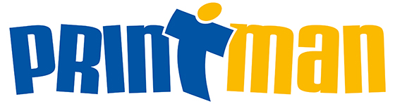
Finally, the design to represent Print Man was completed - the colours are a solid reliable blue teamed with a lively and fun yellow with a simple graphic feature that is a welcoming characteristic of the logo and defines the business, perfectly! This logo will appear on business cards and stationery and begins to form the basis of the company’s branding. To ensure brand consistency across different media platforms, I recommended a complimentary text font for his letters, web site copy and other marketing material.
What started on a snowy day in Romsley, ended with a bright, fun and professional logo and branding!
There are loads, lots... millions!! of Blogs, websites, sources of information out there... I have dismissed loads with a click of a delete key but there have been a few that I have consistently returned to, as I have found the information they have presented has been consistently useful and interesting to me in my visual identity role.
Rather than me just recycling content, I thought I would share with you just 3 of these sources, so that you too can also gain insights that they provide and they will help with your visual identity.
I will still continue to share key stories from these site across my feeds but do check these sites out...
The Brand stylist is a site I often say "that's exactly what I would say!" - some great information on branding a business.
When, as a young student at Art College and art history lessons in particular, the finer points, usually drifted past us. I remembered a few key things that caught my imagination, such as the Pre-raphaelites and artists such as Caravaggio. But sadly, most of it was wasted on young art students.

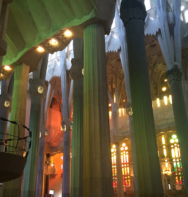
I was aware of Goudà and the Modernisme movement and thought  "Gaud�... Schmoudi!  Whatever!"  However, a recent trip to the Sagrada Familia in Barcelona changed my opinion!

Gaudà is considered to be part of Modernism (I am not a big fan!), but for me his work goes a bit further. His inspiration came from nature, from visits to the mountains, caves and forests. Gaudà looked at organic and haphazard forms in nature and then somehow he found a way to incorporate these forms into his architecture, but in a very geometric way.
I learned about new geometric terms! Such as the hyperbolic paraboloid! The nave in the Sagrada Familia has hyperboloid vaults, inspired by trees. The pillars and branches symbolise trees rising up to the roof. (See above - Brilliant!) This study of nature somehow translated into using simple geometrical forms, essentially straight lines, circles and geometric curves, all of which I found fascinating...Â
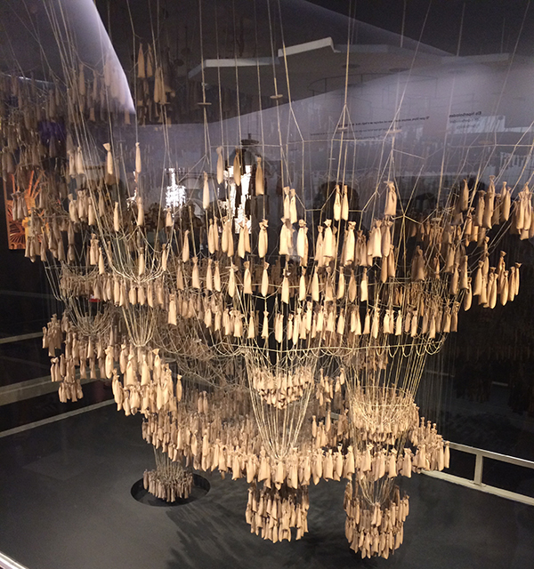
And all of this done in a time without any computers! This photo shows how Gaudi planned, formed, and calculated the Sagrada Familia. He uses strings, ties, and weights to simulate the columns and shape of the cathedral under complete tension. By flipping the image vertically, the columns in tension are changed to compression. Amazing! He considered every aspect of his creations in incredible detail, the ceramics, the stained glass, the ironwork...
Reading about the Sagrada Familia, nothing was done without a reason. Everything symbolised some aspect of the Catholic faith. Different parts of the temple were designed to provoke an emotion, to connect... All this connected with me, and this is how I feel when I design your visual identity... the choice of font, colour and layout is made for a reason and I just love to align things and make shapes...
So after wandering around the Sagrada Familia, taking far too many pictures! (The one below with light flooding through the stained glass windows is one of my favourites!) I found a new appreciation of Antoni Gaudà and how his work might influence my future design projects...
Trying to pin down one day in my design life is not straight forward…
I guess that’s what makes being a graphic designer so interesting – it’s not an orderly, predictable existence. One day is never like the next. I’m always learning… Communicating, planning, outsourcing, networking and even sometimes designing!!
I manage a twisty "A road" (I prefer to get off the motorways!) of information, keeping projects moving forward incrementally – asking and answering questions, putting resources in place, getting it all done and doing my very best to keep my clients happy.
First thing in the morning I ensure the boys are off to school. The older one goes early and the younger one has a short walk to school, often I choose to extend this, so I know what the weather is like outside and that birds are still tweeting!
First action work wise to do in the morning is check my email – it's my in-tray! This is combined with a coffee... (A doughnut too on a treat day!)
Following up on any of these emails with phone calls or replies to ensure all projects are moving towards the deadlines.
On any given day, I will work on a variety of projects, I have worked on designs that feature urinals, then moved on to weddings dresses in the same day! At the core of everything I do is appropriate design that answers the brief… So to get inside and understanding your customers needs is important to me - focussing on what you are working towards is of prime importance when your customers range from Bra retailers to a door manufacturer - both feature knockers, but of a very different kind ;-)
Work can range from branded exhibition boards for a trade show and brochures and leaflets to go with that too. Ensuring all items are ready on time for the truck that is waiting to take it all to the exhibition hall.
Working on signage and vehicle livery designs can be a regular feature when working closely with sign companies.
A typical day can involve choices from 1000’s of fonts and pondering subtle changes of colour and its effect on a design… And getting a layout to “flowâ€.
Late afternoon, my home office becomes more of a home as the boys come in from school… I do try to keep a semblance of work/life balance, but it can be hard for me to stop because my design mind keeps ticking over and I think about your design/creative projects a LOT and you can never be sure where some of my inspiration comes from.
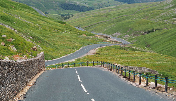
To escape from all this madness I will take my motorcycle on a twisty "A road" and clear my mind, as riding a bike is such a brain consuming activity there's not much room for any other thoughts - a bit like doing creative design but that's a subject for another day…
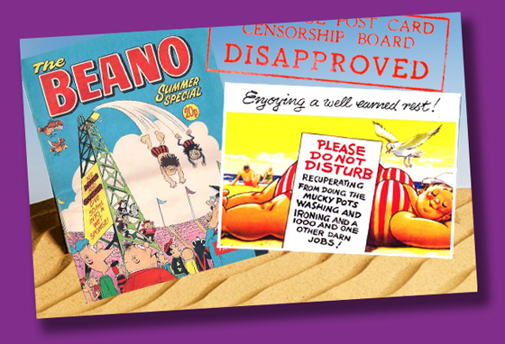
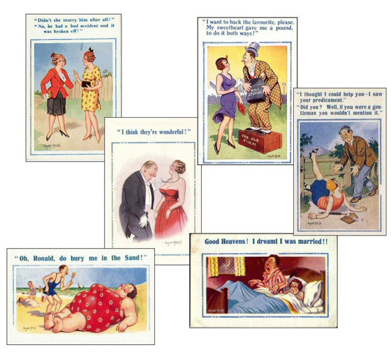
A bit of Hot weather and we are thinking about Summer Holidays... memories of reading "Summer Specials" and sending "Saucy Postcards"...
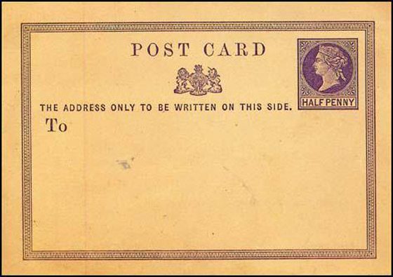
I was looking into the origins of the humble postcard… In 1869, a doctor in Vienna had the idea of producing printed postcards and the world's first official postcard came about. It was a great success and around 2 1/4 million postcards were sold in the first three months.
Britain's first Official Post Card with a printed stamp. (1870)
In Britain, Post Office rules restricted the production of pictorial cards but in 1894 that changed and picture postcards could be sent at the cheapest postal rate. Within the month, postcards featuring pictures of local views, famous landmarks, photographs, animals and drawings were being sent in the post.
In the 1930′s 'saucy' postcards became widespread and at their peak the sale of these postcards reached 16 million a year! Often tacky in nature they made use of innuendo, in the same vein as the "Carry On" films. (Oooo Matron!) In the early 50′s, the government was concerned by the apparent deterioration of morals in Britain and decided on a crackdown on these postcards with local censorship committees set up, leading to fines for breaking the Obscene Publications Act! The demise of the saucy postcard occurred during the 1970′s and 1980′s, but postcards continue to be a significant economic and cultural aspect of British seaside tourism.
I love some of the graphics that appear on postcards old and new and still these humble little cards are an great marketing tool! My inspiration comes from many sources - childhood memories of "Summer Specials" and "Saucy Ideas" have sometimes fed back into my designs! I hope you enjoy your well earned holidays… Drop me a postcard!
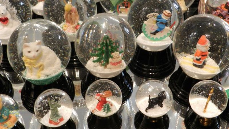
Erwin Perzy III, the 57-year-old Austrian is the grandson of the man widely acknowledged as the inventor of the snow globe. His grandfather, the first Erwin Perzy, came up with the idea by accident in 1900.
Mass production started in Vienna in 1905, and 108 years later, the company - Original Vienna Snow Globes - is still going strong.
Mr Perzy III has been in charge since the early 1980s and the company, despite having only 30 employees, 15 of which work from home, produces about 200,000 snow globes a year.
Unlike cheaper rivals from the Far East, the company's snow globes are handpainted and manually assembled, and the actual globe is still made of glass rather than plastic.
Despite the company's small size, and relative obscurity among those not knowledgeable about snow globes, it continues to have some illustrious customers.
Recently it has made globes for US President Barack Obama's children, and in the past it has produced them for former White House incumbents Bill Clinton and the late Ronald Reagan.
And the snow globe that falls and smashes so dramatically at the start of the 1941 movie Citizen Kane was made by Original Vienna Snow Globes.
Mr Perzy III, who took over the running of the company from his father, Mr Perzy II, says it was never in doubt that he would join the family business.
The company has 350 designs in its standard range of show globes
"I like it, it is like a hobby," he says.
"I think I'm not very important, [but] the snow globe is a thing which gives some magic and enchantment to people."
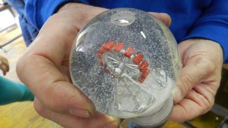
Miniature diorama
Mr Perzy I, a surgical instruments mechanic, accidentally created the first snow globe in 1900 as a result of an experiment to try to improve the brightness of the newly invented - and then not very bright - electric light bulb.
The company's founder invented the snow globe in Vienna at the very start of the 20th Century
He was inspired by the shoemakers of the time, who to get more light from a candle mounted a glass globe filled with water in front of the flame. This gave them a light spot the size of a hand.
This was the principle that Mr Perzy I wanted to re-create in front of a light bulb, but found that it did not work very well.
His grandson picks up the story: "And one day he found a white powder, semolina, used for baby food. And he poured it into the glass globe, and it got soaked by the water and floated very slowly to the base of the globe. This effect reminded him of snowfall.
"And this was the very first, the basic idea for inventing a snow globe."
The next step was to add a miniature diorama, which for the first 40 years of production was always a church.
Erwin Perzy II took over from his father after the Second World War and introduced different designs, such as Christmas trees, Father Christmas and snowmen figurines.
Mr Perzy II also introduced a new material for the artificial snow, which remains a company secret.
'They are enchanted'
The company now has 350 different designs in its standard range, but thousands of others that customers can specially order. Customised orders make up 20% of total sales.
The artificial snow is made of a material that is a company secret
There are four different sizes of globes, and some suppliers will not ship them in very cold weather in case the water freezes, expands and cracks the glass.
Mr Perzy III says he continues to be most enthused about the business when he sees how excited children are as they visit his factory, which doubles as a museum for all things snow globe.
"Nowadays kids have everything... I mean, they have computers and lots of other electronic things, and our snow globe has nothing, no battery, no nothing," he says.
"And when the kids come here, their eyes are wide open, they are enchanted, and everyone has one or two snow globes in their hands, and they are shaking them. That is a very nice moment for me."
Looking to the future, Mr Perzy's daughter is going to eventually take over the reins.
He says: "My daughter is 24 years old, and at the moment she is working on taking over the business in 10 years from now. She is doing a very good job here."