


“A fresh brand helps symbolise the new era Qantas is entering as we head towards our centenary. It’s an era of new destinations, new technology and a new standard of service,†said Qantas CEO Alan Joyce.
“This is not just a change of logo; it is far greater than that. There is a significant transformation programme across Qantas and on-going investment and commitment to continuing to improve the overall brand and customer experience,†said Olivia Wirth, Qantas Group executive brand, marketing and corporate affairs.
It will be down to the customers of Quantas and their “customer experience†of the brand to see whether it hits the mark... What do you think?
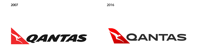
From a visual branding opinion, has it hit the mark?
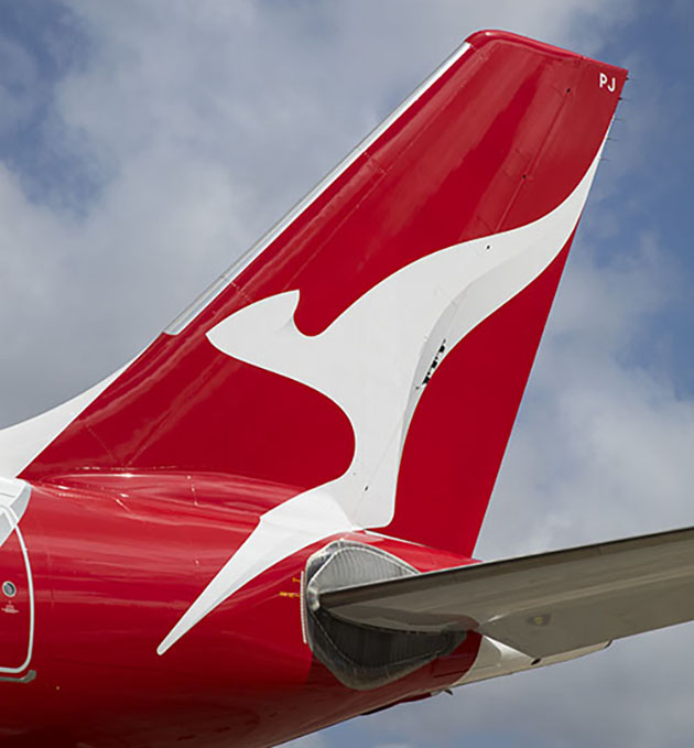
The new roo!. Very subtle shading on roo’s body and tail
(Almost unoticable!). (Pic Seth Jaworski)
The design agency said “This new brand is more streamlined and the shading behind the kangaroo gives a better sense of movement and depth. A silver band now extends from the tail to the rear of the fuselage, to give a more premium feel,â€
“The typography for the word Qantas, which measures almost two metres high on the 787, has been carefully streamlined. And Qantas will appear on the aircraft’s belly, so you can tell when it’s the national carrier flying overhead.â€
Quite how you “streamline†the typography, I thought it at least would need some movement and it pretty lacking in that! Has it been taken that streamlining means to remove personality from our brand? Let me know what you think...
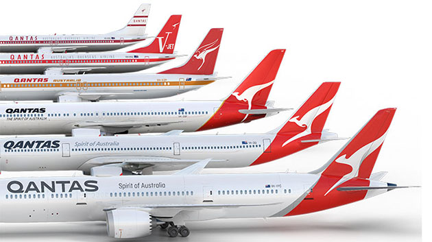
NEW QANTAS BRAND SUMMARY
- A streamlined kangaroo on the tail of the aircraft, with shading to give it a sense of depth and movement. The kangaroo itself has been simplified for a cleaner, more modern look.
- A silver band has been added to the rear of the aircraft, flowing from the tail through to the rear of the fuselage for a more premium feel and more contrast between the red tail and the rest of the aircraft.
- A new, slimmer font for the world ‘Qantas’ on the side of the aircraft and the colour made slightly lighter.
- The word Qantas is added to the belly for increased visibility when aircraft are flying overhead.
- Adding the kangaroo to the inside curved edge of the wingtips so that they are visible in-flight and meaning they will also appear in pictures people take out the aircraft windows.
- Replacing, centring and enlarging the kangaroo that appears on outboard engine cowls, so that it is more prominent and identifiable.
- Re-introducing the iconic ‘winged kangaroo’ that featured on Qantas tails in the 1960s, ’70s, and ’80s by placing it under the cockpit window and integrating it with the aircraft name currently in this position (note: the actual aircraft names are unchanged). The classic ‘Qantas red’ and white of the fuselage are unchanged.