

A phone call from Rob and a meeting at my local pub was the start of a neat logo. I remember the day, it snowed and I was concerned about his return journey, I know what the weather can be like up in Romsley!
Rob had T-shirt printing business and he wanted to present a professional image, so he invited me to work with him. We talked about Rob as an individual, his personal values and why his business was important to him. He said it was getting the job done and getting it done well that mattered. The company name was going to be Print Man and it was about the man not just printing T-shirts.
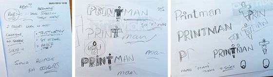
Initially, we discussed words to describe his business, solid, trustworthy, confident, credible, reliable and pride. Rob is a personable chap and I was keen to reflect his personality. I also asked him to do some homework - to look out for any design ideas that he liked. At that first meeting, I made some initial sketches, to see if the business name worked better in capitals or lower case then adding some shapes that I had in mind... I imagined the ‘T’ in the word print becoming the shape of a person...adding a circle for the head it became a figure with the arms stretched in a welcoming pose...I also sketched the ‘T’ curved – like peeling off a transfer.
It can be great fun to choose what I see as the most appropriate choice of fonts. Thinking about the adjectives, solid, trustworthy and so on, I needed to choose strong, solid fonts that were clear, trustworthy and dependable but needed to be informal. At the outset, I picked 20 - 30 fonts but then needed to be selective and whittled them down to 6 - 10 fonts. Combining these with the sketches formed the basis of the visual concepts. Working to combine these ideas and all the information that Rob had given me, developing the design and focussing on the combination of shapes and forms is quite a difficult process to explain! Eventually, six concepts were ready to present to Rob.
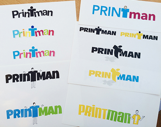
I love to see my customer’s reaction when I first present concepts. Listening very closely to their feedback and observing their reactions to the designs can tell me a lot! From the six concepts, we took two and refined them. Together, we took one font from one concept, transferred into another and developed the colour scheme. This was the start of the process of the customer taking ownership of his logo.
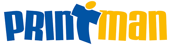
Finally, the design to represent Print Man was completed - the colours are a solid reliable blue teamed with a lively and fun yellow with a simple graphic feature that is a welcoming characteristic of the logo and defines the business, perfectly! This logo will appear on business cards and stationery and begins to form the basis of the company’s branding. To ensure brand consistency across different media platforms, I recommended a complimentary text font for his letters, web site copy and other marketing material.
What started on a snowy day in Romsley, ended with a bright, fun and professional logo and branding!