Arden Windows Ltd is a high-end window manufacturer based in Coventry. When I started working with them, their trademark was simply a logo. My remit was to develop a wider visual identity for their brand including an appropriate font and layouts to promote an authentic message that represented Arden’s ethos and brand position.

Understanding the company’s products, culture and expectations was fundamental to the development of a powerful visual identity. Clarity, creativity and consistency would ensure Arden’s brand would stand out against their competitors. The typeface reinforces the precision engineering used in the manufacturing processes. All designs had to be in line with their pre-existing marketing materials.
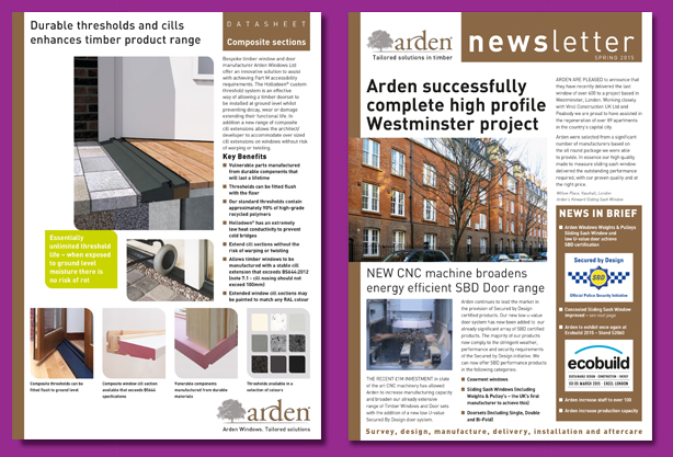
After a comprehensive briefing with my client combined with my detailed knowledge of the principles and rules of graphic design, the creative process can proceed quickly. After the initial proof, the layout rarely needs major changes. A few minor refinements will conclude the final product.
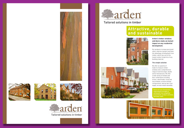
The principle material from which Arden’s windows are manufactured is sustainable wood so the logo and colour palette reflect the environmental and organic credentials of the product. In 2015, Arden Windows exhibited at the Ecobuild exhibition at Excel in London. The visual identity was developed to work on large-scale exhibition panels. The finished designs were then printed directly onto Foamex. A decision was taken early in the design process to include several panels that were text biased, these panels proved very successful. When the stand was busy, visitors could read useful information about the product.
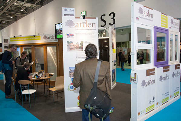
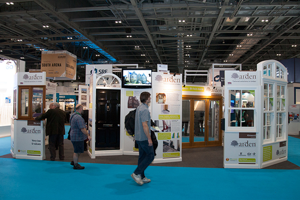
To avoid handing out the more expensive larger format brochures, we created additional support material for the exhibition, specifically small leaflets to distribute at the show.
The production deadline for the project was three days before the London show when a vehicle was leaving the client’s premises. So working back, gauging lead-times for all elements of the assignment, ensuring all dates for each separate part, all came together to be loaded onto that truck! (I designed the livery for the truck too!)
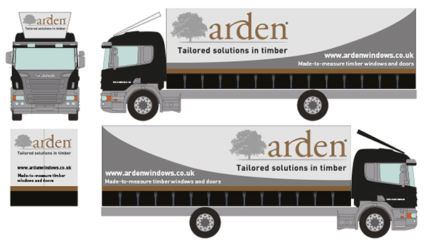
The exhibition was a great success, with many contacts signed, orders taken and enquiries generated for new business. After the Ecobuild exhibition, we publicised the client’s accomplishments on their website and in their newsletters.
Ecobuild 2015 was so successful that a stand was booked at the 2016 exhibition and we are just completing that work now!
